

Video links in SERP results can boost organic traffic by 157%, and landing pages with video are 53% more likely to show up on search. In other words, you only have a few seconds to impress, seconds to engage, and seconds to make visitors stay.
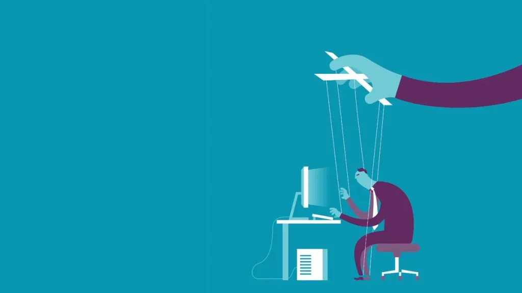
Bare-bones sites just don’t cut it anymore. Today’s audiences expect more—movement, interaction, even a story unfolding right in front of them. That’s where UI animation comes in. It doesn’t just look good; it guides, persuades, and leaves a lasting mark on your brand.
In this blog, you’ll learn how today’s smartest brands are leveraging animation to create powerful, future-ready websites — and how you can, too. Keep reading, because the next big upgrade to your site could start right here. Let’s begin by exploring why UI animation matters in websites and how it can transform your customers’ experience with your brand.
What is Web Animation?
UI animation today isn’t just about clicking buttons or moving menus—it’s about micro-interactions that respond instantly, scroll effects that feel cinematic, AI-driven motion that adapts to users, and 3D product views you can spin and explore. You’ll see it in dark mode-ready transitions, personalized onboarding, and interactive storytelling that plays like a short movie as you scroll.
By 2026, animated UI will be everywhere—from e-commerce to SaaS dashboards—turning static screens into engaging, interactive experiences that boost usability, drive engagement, and signal to search engines that your UX is top quality.
Apple’s Principles for Animation
Now that we understand animated UI in a web-based context, we can look at how Apple—a global design leader—shows that the timeless rules of animation still make today’s UIs feel natural, responsive, and engaging.
1. Clarity
Interfaces need to show their status and guide users on what to do next. Text, spacing, and especially motion are used to highlight changes and draw attention.
How Apple uses it: Apple uses it to create clear transitions—like fades or slides—when shifting to new content, instead of sudden jumps. This motion isn’t just decorative. It supports order and readability.
How you can apply it (web): Animations that reveal structure: fading in error messages, sliding in menus, or highlighting a main button on hover. Keep decorative motion minimal so clarity stays front and center.
2. Deference (Content First)
The interface must serve the content and not compete with the content. Motion should be used in a manner that puts the experience in perspective rather than taking away its focus.
How Apple uses it: Subtle animation—Apple uses light transitions or translucent overlays to guide users without pulling attention away from the content.
How you can apply it (web): Use soft motions to frame key elements—for example, a gentle fade on background overlays or a smooth slide on a navigation drawer. Keep animations for websites meaningful so the content stays in focus.
3. Depth
Motion can establish a hierarchy of space and help users understand where they are and where they’re going.
How Apple uses it: Apple tends to zoom in on detail pages or layer content with parallax to maintain context. Such animations for websites make the user feel like they are moving in space instead of clicking on random jumps.
How you can apply it (web): You can use animations like card expansions, zoom-ins, or sliding panels to show progress. Shadows, blur, and animated overlays can add depth and help guide navigation.
4. Feedback & Direct Manipulation
Users must get the sense that the interface will respond immediately to user input. Movement is a validation that an action has been logged.
How Apple uses it: Apple has leveraged the pull-to-refresh elasticity or instant pressed states to provide a user with feedback as a responsive animation.
How you can apply it (web): Animate hover, click, and drag states. You can use these examples: a button that depresses a little when you press it or a progress bar that animates as it fills. Such micro-animations for websites create a sense of trust and bring interfaces to life.
5. Consistency & Familiarity
Patterns of animation should be predictable to lessen confusion and create confidence in the user.
How Apple uses it: Apple maintains the looks and gestures of the apps so that the user quickly knows what to expect.
How you can apply it (web): Consistent motion patterns—use the same motion patterns across your application—make your modals always slide up and notifications always fade in. Repetition helps make your animations intuitive, not surprising.
6. User Control
The animations must have user control and must not trap the users. Individuals ought to have the ability to reverse, withdraw or reject easily.
How Apple uses it: Apple animations can be reversed (e.g., swipe to close or undo). That is because the control lies with the user as confirmed by the motion.
How you can apply it (web): Animate design elements that have two directions, such as dismissible toast messages or cancelable loaders. A graceful back-and-forth transition helps to assure the user that they can always take a step backwards.
7. Fluid, Natural Motion
The animations must have a sense of reality in the world, and a sense of ease and momentum.
How Apple uses it: iOS transitions are gesture-based, which means they move in response to touch and create the impression of physical objects.
How you can apply it (web): You should use ease curves, rather than linear animation and you should allow the motion to run. As an example, consider a panel that slides in and decelerates rather than latching on.
8. Performance & Responsiveness
To make animation useful to the UI, it needs to be fast and smooth. Lag breaks immersion.
How Apple uses it: Apple uses high frame rate optimization of animations to make interactions fluid and lightweight.
How you can apply it (web): Use properties such as transform and opacity to perform better, and also use short animations. Fluid performance makes motion useful, as opposed to frustrating.
9. Accessibility & Adaptivity (incl. Reduce Motion)
It should be possible to customize animations to user needs and preferences, such as motion sensitivity.
How Apple uses it: Apple provides system-wide options such as Reduce Motion settings, which can help users make sure that animations are simplified or turned off.
How you can apply it (web): Respect browser preferences such as prefers-reduced-motion. Explain with animations, but have simpler options where motion may be overwhelming.
10. Platform Craft: Details That Matter
Minor animated elements enhance comfort and ease.
How Apple uses it: Apple perfects micro-interactions, such as the iPad pointer that can adapt its size to the target or the widget that enlarges in a polished manner.
How you can apply it (web): Add micro-animations: Hover glows, focus highlights, or notification badges bouncing slightly when updated. These facts are pleasant without being too many.
These values are put to life at Swift Animation, where we create best website animations that feel contemporary, responsive, and memorable. When you are willing to transform your UI into something users will enjoy, it will happen together.
Modern Web Animation Techniques (2026 Trends)
Keeping the rules of timeless design in mind that Apple has, we now turn to the contemporary techniques of animation that will characterize 2026, pragmatic means of putting those principles into practice on actual websites. They are not only creative techniques, but also measurable, and they motivate engagement, retention, and SEO. And the numbers prove it.
1. Ultra-Fast Micro-Interactions
Small, instant animations—like a button popping when tapped, a heart icon glowing, or a progress bar flashing—confirm that an action worked. They shouldn’t distract; only provide quick feedback.
Why It Matters (2026): U.S. users expect instant response. On mobile, especially, any lag or jerky motion feels broken. Fast micro-interactions create a smooth, responsive feel that keeps users in control.
SEO/GEO Advantage: Google’s 2026 Core Web Vitals Interaction to Next Paint (INP) measures responsiveness. Micro-interactions help reduce INP, improve rankings, and signal strong UX to generative search engines.
2. Dark-Mode Friendly Motion
Dark interface built animations. In place of hard whites and blaring flashes, they employ gentle smoothing, dull gradients and gentle motion blur. On the menu, an example would be to fade in with a soft glow instead of a pop.
Why it Matters (2026): In 2026, most devices are set to default to dark mode. People spend hours on the Internet, and aggressive animation may lead to eye pain. Dark interfaces with motion are more comfortable and polished and users will spend longer.
SEO/GEO Advantage: Sites that adhere to user preferences (dark mode + less motion) reduce the bouncing rate and enhance the trust cues. Search engines can see that people do not leave pages because they feel uncomfortable, and this indirectly helps rankings.
3. AI-Powered Personalized Animations
Changing animation with user behavior. When a person is skimming, the animations either accelerate or simplify. Animations can get richer and more layered if a user is immersed. AI personalizes the experience on the fly.
Why it Matters (2026): U.S. users demand personalization everywhere: Spotify suggests music, Netflix customizes thumbnails, TikTok selects a feed. Introducing this into UI animations makes websites seem smarter, as though they are aware of how fast or slow the user works, and prefer to work that way.
SEO/GEO Advantage: AI-based movement enhances dwell time and interaction level. Because generative search results are sensitive to engagement metrics, adaptive animations can increase the visibility of a site by indicating a highly relevant, user-centric experience.
4. Cinematic Scrolling and Parallax
The page is a movie-like experience instead of being a static scroll. Elements move within layers (parallax), appear as though they are fading in as part of a scene cut, or go horizontally like a slide show. The scroll is not merely navigation—it is narrative.
Why it Matters (2026): Attention span is short in 2026, but storytelling is strong. Film scrolling creates a feeling that the users are sharing a story and not reading a page. This particularly applies to luxury brands, product lines, and portfolios.
SEO/GEO Advantage: The longer users scroll, the stronger is the signal to Google and AI engines that your site is interesting and useful. Bouncing is minimized and the depth of the scroll is enhanced by smooth parallax motion- both good ranking factors.
5. Cursor and Hover Effects
The very cursor is included in the design. It can transform into shapes, leave interactive trails, or cause hover effects as it passes over elements. Consider a retail site in which the cursor becomes a magnifying glass on products.
Why it Matters (2026): Small details like this build brain personality. They create a memorable site amidst a plethora of sameness, and this is particularly critical in the U.S. where users have high expectations and competition is intense.
SEO/GEO Advantage: These animations are not only pretty but also make users spend more time on the page. The longer they hover, browse, and interact, the more send-outs the search engines get that your site is providing a good experience.
6. Experimental Navigation & Non-Traditional Scrolling
Leaving the traditional top navigation bar behind. Consider radial menus, sideswipe, diagonal scrolling, or hand-based AR/VR menu responding.
Why it Matters (2026): Navigation is a brand statement. Non-traditional solutions are innovative and will draw the attention of the user immediately. In the case of design-intensive industries such as fashion, media, or tech startups, this can be hugely significant.
SEO/GEO Advantage: The creative navigation should be balanced with usability. Rankings are hurt in case search engines or users cannot find the content easily. However, when done properly, it enhances user traffic and retains visitors as they continue browsing your site.
7. Interactive 3D and Product Models
Rather than seeing a flat product image, users can rotate it, zoom in, and interact with 3D models directly on the site. You can even tour furniture, cars, real estate, and even clothing before buying.
Why it Matters (2026): In 2026, e-commerce will be about online try-before-you-buy. American consumers want to experience products in an immersive manner without the need to move out of their residences. Interactive 3D causes confidence and less hesitation in purchasing.
SEO/GEO Advantage: Rich, interactive graphics will enhance time-on-page and content salience in generative search results. Engines are interested in media-rich interactive formats as they enhance user satisfaction.
8. Organic Shapes and Subtle Motion
Replacing angular grids and square boxes, this movement employs natural and flowing forms, textures, and organic movements, such as blobs floating softly or forms vibrating softly.
Why it Matters (2026): Organic design is human and approachable in a world of precision created by AI. Natural, less-mechanical interfaces resonate with the emotional state of U.S. audiences, particularly in the lifestyle, wellness, and sustainability sectors.
SEO/GEO Advantage: Organic motion creates a powerful emotional brand image. Users associate with a brand on an emotional level and will come back to the brand more often, increasing retention and organic presence.
9. Accessible Micro-Animations (Reduce Motion)
Animations that are respectful of accessibility settings. When a user has the reduce motion option turned on in their device, the site will automatically scale back effects, but maintain functionality.
Why it Matters (2026): Making accessibility optional is now illegal, unethical, and anticipated. Inclusive animation enables all people to love your site, no matter what sensory or cognitive requirements they have.
SEO/GEO Advantage: An easy-to-use design reduces bouncing and promotes trust. This is a ranking and branding benefit because Google has continually rewarded websites that use best practices in accessibility.
10. Scroll-Triggered Light Effects
Delicate lights, luminous gradients, or gentle light effects come into play when users scroll. Here are some examples of how text can be lit up as you hover the cursor over them, or how buttons can flash as they come into view.
Why it Matters (2026): Gives it a futuristic, premium touch without overwhelming the user. It is contemporary and fun—just what audiences in 2026 will desire.
SEO/GEO Advantage: These light animations will increase visual appeal without negatively affecting the load speed. That performance/design balance is central to Core Web Vitals and generative ranking signals.
Final Words
Animation is not only limited to movies but has expanded to advertising, education, healthcare, and digital experiences. This demonstrates how animation is no longer a side show to websites—it is becoming a standard expectation of an engaging user interface. The question is therefore, how do you include UI animation in your site today? The solution is to combine clean design and smart motion that will make your site easy to navigate, fun to explore, and keep people eager and interested every single second.
We, at Swift Animation, are experts at transforming a dull site into an exciting one that enhances visitor interactions, search engines, and sales. We can build a site that relocates your audience and your business.